
According to Statcounter, mobile users eclipse desktop users by a wide margin and this trend is going to continue for the foreseeable future. That’s why you must prioritize mobile-friendliness while building websites. However, that doesn’t mean you can afford to abandon desktop users. So, what’s the solution? Responsive Design!
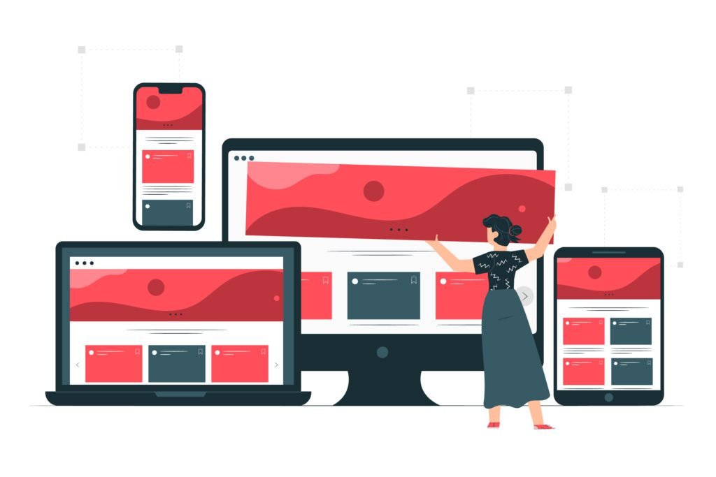
Responsive site designs boast a user interface that automatically adapts to different screen sizes and devices. Apart from enhancing the user experience, this brings a whole host of benefits. However, how do you achieve responsive web design?
Before we learn about the benefits of responsive web design, let’s figure out how developers achieve a site that dynamically adjusts to different screens. It primarily stands on three pillars:
Great, you know how responsive web design is achieved. But, what is the purpose of responsive web design? Let’s find out!
The main purpose of responsive design is to provide a seamless and consistent user experience on any device. Users don’t need to deal with frustratingly small texts, zoom in to see an element, or come across dreadful and unintuitive horizontal scrolling. That’s why responsive design isn’t just a web design trend, but the norm.
When you adopt responsive web design, your site is easily accessible without any compromises across all devices- mobiles, tablets, and desktops. There’s no clunk to deal with. Instead, everyone who browses your site gets a wonderful experience, and that increases engagement metrics.
Google switched to mobile-first indexing back in 2020. That means when Google’s crawlers index websites, they prioritize the mobile version over the desktop version. Moreover, as responsive design leads to a seamless user experience, it also promotes engagement time on your site, boosting your site’s rank on the search results page.
With a responsive design, you don’t need to create and maintain separate versions of your website for desktop, mobile, and tablets. Since you need to deal with just one website, it drastically reduces both your development and maintenance costs.
Whether you are an online store or someone who sells his services through an online portal, you have a brand to maintain. Customers mustn’t get mixed messages when they open your website to learn about your offerings, book an appointment, or buy a product. The importance of responsive design lies in the fact that it allows you to stay consistent with your brand across all devices, whether a customer opens the site on their computer or their phone.
It’s a mobile-first world and has been this way for many years. That’s why responsive design isn’t a luxury anymore, but a necessity. Moreover, most modern WordPress themes and drag-and-drop site builders have responsive themes. So, what’s stopping you from adopting it? Let us know how you benefited from responsive design in the comments.

Mr. Robert Willson is one of the few geeks who never gets tired when it comes to technology. From the latest gadgets to AI and machine learning, Mr. Willson translates them into easy-to-digest insights. Where there is tech, there is him!
 The Ultimate Guide to Robotic Lawn Mower Features
 Smart Homes, Smarter Living: How Technology Is Redefining Luxury at Home
 Top 5 Custom Jacket Patches Makers in the UK
 How AI Is Making App Building Accessible to Everyone With Claude Vibe Coding
 What Is Pay TV in Australia and Is It Still Worth It Today?